Customers will likely come to your help center multiple times to solve their issues. For this reason, I recommend creating structure in the way help is found and how you create articles. Help your customers to know what to expect from your content and where it lives. Read my top four tips below to help you get started.
- Improve navigation
When customers arrive at your help center, make sure that it is clear where they can find topics. Do this by closely mimicking the flow of the product(s) that you offer. One way of doing this is by utilizing categories for each core feature. Does that core feature have advanced options that need multiple articles to explain? Create a subcategory to have them all neatly organised. - Create a clear expectation of what each article contains
Having an article titled “How to create” isn’t very descriptive and may waste a customer’s time. Aim to title your articles in a way that it concise yet also explains what the customer will get out of it. For example, we could alternatively use “How to create a new video”. This title tells the customer immediately what they can learn by reading your article. In addition, I suggest adding a short paragraph (even a sentence will do) that introduces the article and provides some extra context. It could include the targeted audience, what subscription plan they need, the location of the feature, or anything else they may need before getting started. By doing so, you will ensure that the article will fulfill the readers expectations. - Use consistent formatting and writing style
Strive to have all of your articles look and read the same. While this can take a while to achieve (especially if you already have a lot of content), the result is a help center that is slick and professional. It also shows your customers that much time and thought has gone into producing the content, creating trust. Create your ‘perfect’ article and then use it as a template for all future articles. - Improve images
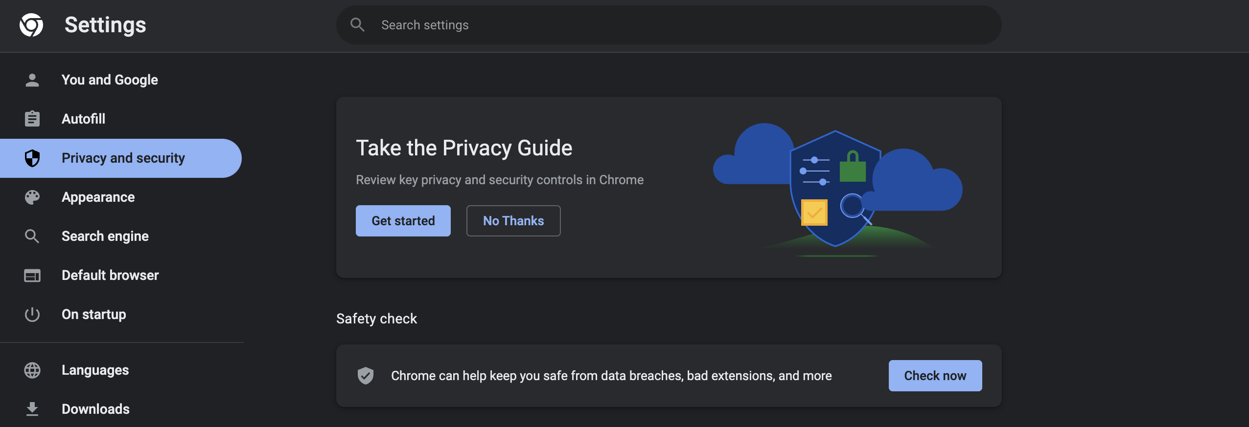
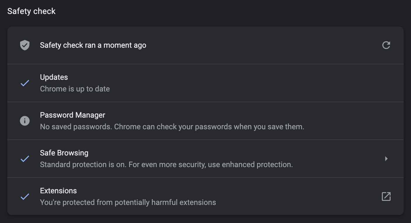
It’s always good practice to include visuals in your article, but having screenshots of varying sizes looks messy. Why messy? Well, the platform you use for your help center may stretch images to fit the full width of the webpage. Take a look at the two screenshots below with different widths. The text on the first image is much harder to read, especially on smaller screens. To combat this, aim to use the same width for each article—I typically use 1200px.

